
- Numpy time objects are internally represented in seconds from midnight
- Fill_between is generally easier to use than fill
I’m going to start this post off with a clarification. The type of “heat map” I’m talking about isn’t the full-spectral-color-progression that comes to mind. These are also often used in the word of sports analytics (pitches thrown in the strike zone, field goal locations in basketball, etc.).

Introducing the “Heat Map”
The “heat map” I’m talking about is a hue-intensity chart. The hue’s intensity corresponds to a percentage of the overall measure. Confused? Nah, you’ve seen this sort of thing before. The image below is actually similar to the graph I’m about to produce. These types of graphs make it easy to get a relative feel for the distribution of data in a set, based simply on the color intensity.

Data
I mentioned there would be a time domain involved. However, unlike the example above, my data aren’t binned into one hour time slots. They’re also not measured against a particular day of the week on the y-axis. Rather, I’m dealing with homes’ power consumption data over the course of a month. I’m trying to find out when during the day residents are using electricity the most often and how much power they’re consuming. The data are proprietary, so I can’t share them, but here’s a sanitized sample. This gives an idea of the pandas dataframe format and naming.
| 2014-08-01 | 2014-08-02 | 2014-08-03 | |
|---|---|---|---|
| 0:00:00 | 0.2 | 0.15 | 0.15 |
| 0:01:00 | 0.2 | 0.15 | 0.15 |
| 0:02:00 | 0.22 | 0.15 | 0.15 |
| … | … | … | … |
| 23:57:00 | 3.4 | 3.4 | 0 |
| 23:58:00 | 3.4 | 3.4 | 0 |
| 23:59:00 | 3.4 | 3.5 | 0 |
Let’s assume I have this information for 30 straight days. So what I want to do is plot, what is essentially a histogram for each minute of every the day, at an opacity of 3.33% (1/30). For instance, let’s say the that from 8:00-8:01 AM on the first day, a home’s power draw is 1.2 kW. For that particular minute of the day, a bar colored at 3.33% opaque will be plot up to 1.2 kW. If, during the second day, the home’s power draw is just 0.4 kW over the same time period, the resulting graph will be colored 6.66% up to 0.4 kW, 3.33% from 0.4 to 1.2 kW, and 0% above 1.2 kW. The opacities will continue to “stack” until all 30 days have been plotted.
Process
This could technically be done with the histogram plotting module built-in to matplotlib, but it’s not at all efficient. Instead, I want to use fill_between.
Be wary of using fill rather than fill_between. It can result in some unexpected results, especially while using numpy arrays.
The first thing I do is count how many days worth of data I have, and calculate each day’s opacity level.
days = len(temp.columns)
opacity = 1/float(days)
Next, I establish the plot handles and loop through all the columns in my dataframe, plotting each day at the specified opacity level. Note how when I give the arguments to fill_between, I make sure to cast the temp[col].values as floats, rather than the generic “O” data type. If you leave this out, you’ll likely run across a fun error:
TypeError: ufunc ‘isfinite’ not supported for the input types, and the inputs could not be safely coerced to any supported types according to the casting rule ”safe”
fig, ax = plt.subplots()

for col in temp.columns:
  plt.fill_between(temp.index, 0, temp[col].values.astype(float), facecolor='blue', alpha = opacity)
  plt.title('Daily Power Consumption for a Given House')
  plt.ylabel('Power (kW)')
  plt.xlabel('Time of Day (HH:MM:SS)')
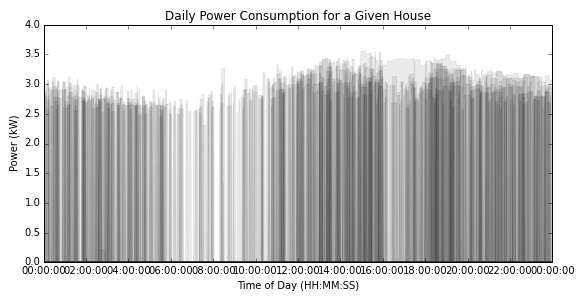
So far, this is what we’ve got.

Adjust for Time Domain
At this point you’ve probably realized why I made such a big deal about this heat map being over a time domain. The bounds aren’t set from midnight to midnight, and the major tick marks on the x-axis are all kinds of funky.
These eyesores can be easily fixed, though. First I explicitly specify the xaxis limits by using the actual domain’s values. Next, and this is the entire point of the post, I build an array that will locate each of the tickmarks. Remembering that the range function is inclusive of the starting value, and exclusive of the last specified value, I create a range from 0 to 93600 seconds (0-26 hours) that increments every
7200 seconds (2 hours). The reason we do it this way is that the numpy time variable are internally represented as seconds from midnight.
xlim(temp.index[0],temp.index[-1])
ax.set_xticks(range(0,60*60*26,60*60*2))
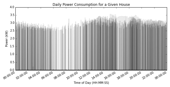
That gets us to this point.
The xaxis is completely illegible, so we let the plot know we’d like it to automatically clean up its mess based on the fact we’re dealing with dates (I know, they’re technically times, but times are a specialized date class) before tightening up the plot area and saving the plot!
plt.gcf().autofmt_xdate()
plt.tight_layout()
plt.savefig('heatmap_time_domain_complete.png')
Pretty neat, huh? You can even see the extremely obvious drop in power consumption at 4:00 PM. That’s evidence of some of my work on demand response.
Missing Legend
“Hey,” you might say. “There’s no legend on that plot, it’s completely useless!” Good observation, reader. The reason for that is that it’s not technically a legend, and it’s actually a separate subplot. I’m going to cover how to create the legend in a later post!
If you’re looking for the finished code for this heat map, here it is:
import matplotlib.pyplot as plt
import pandas as pd

#Build the dataframe described above

days = len(temp.columns)
opacity = 1/float(days)

fig, ax = plt.subplots()

for col in temp.columns:
  plt.fill_between(temp.index, 0, temp[col].values.astype(float), facecolor='blue', alpha = opacity)
  plt.title('Daily Power Consumption for a Given House')
  plt.ylabel('Power (kW)')
  plt.xlabel('Time of Day (HH:MM:SS)')

xlim(temp.index[0],temp.index[-1])
ax.set_xticks(range(0,60*60*26,60*60*2))

plt.gcf().autofmt_xdate()
plt.tight_layout()
plt.savefig('heatmap_time_domain_complete.png')